quantilope
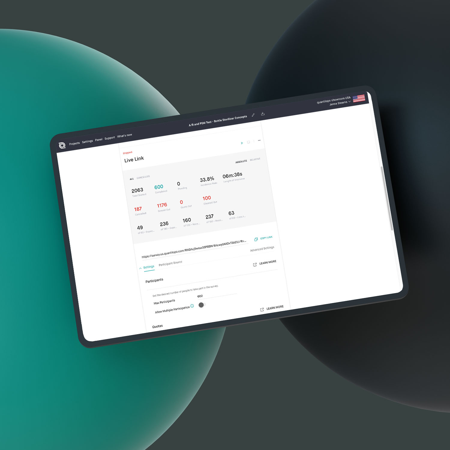
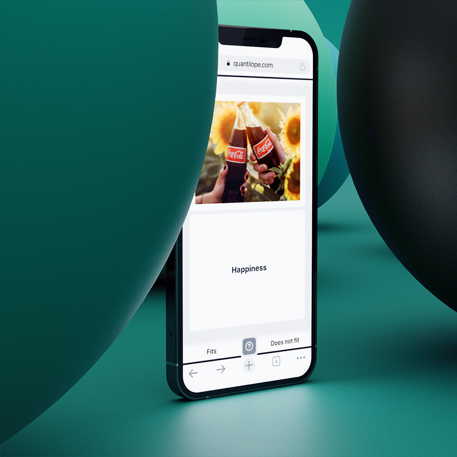
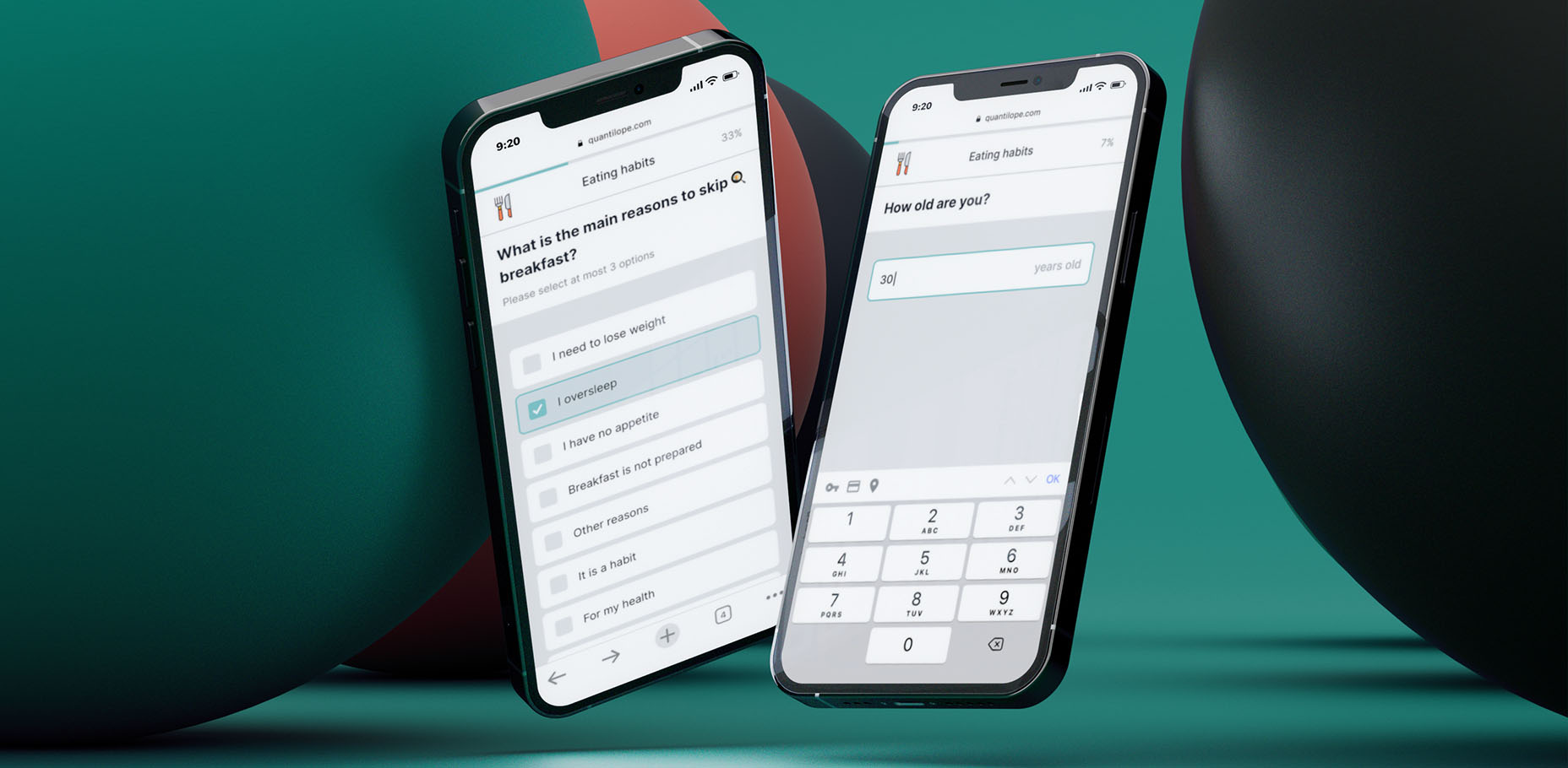
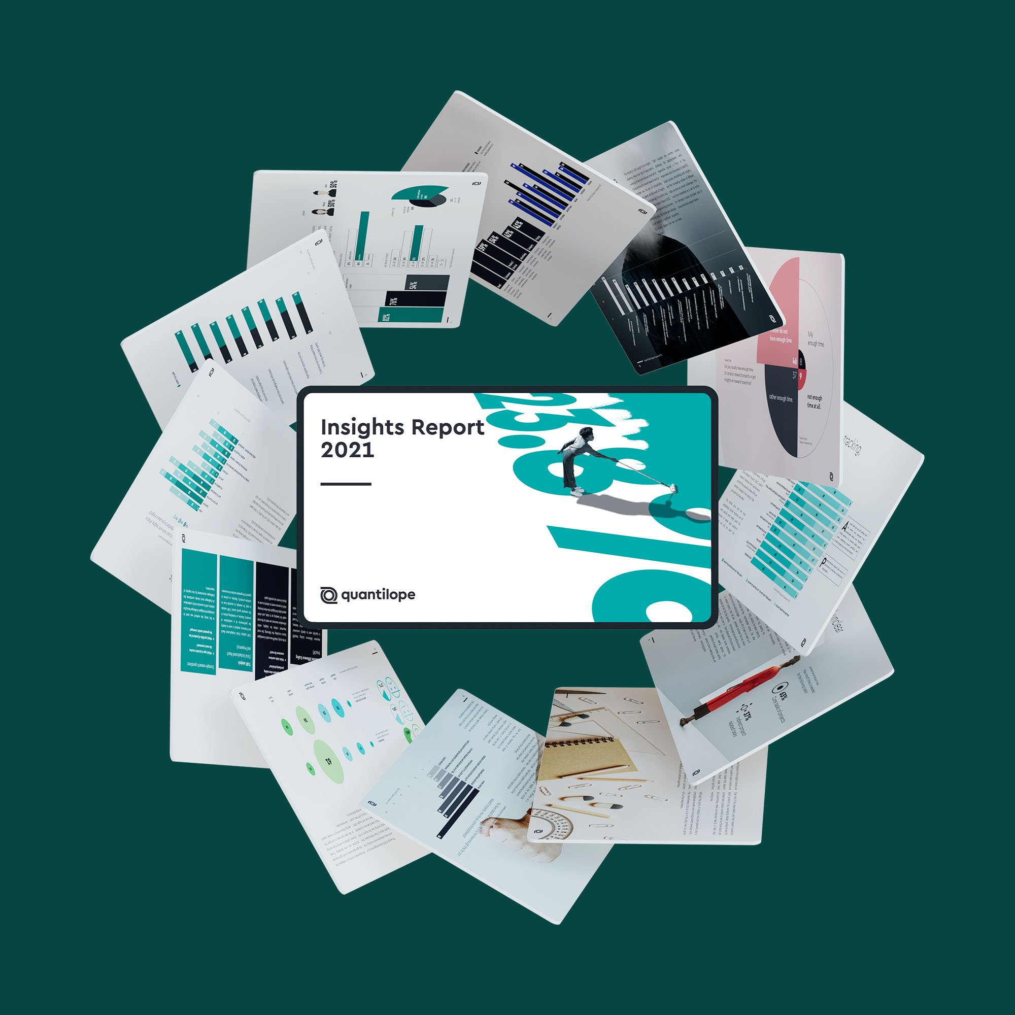
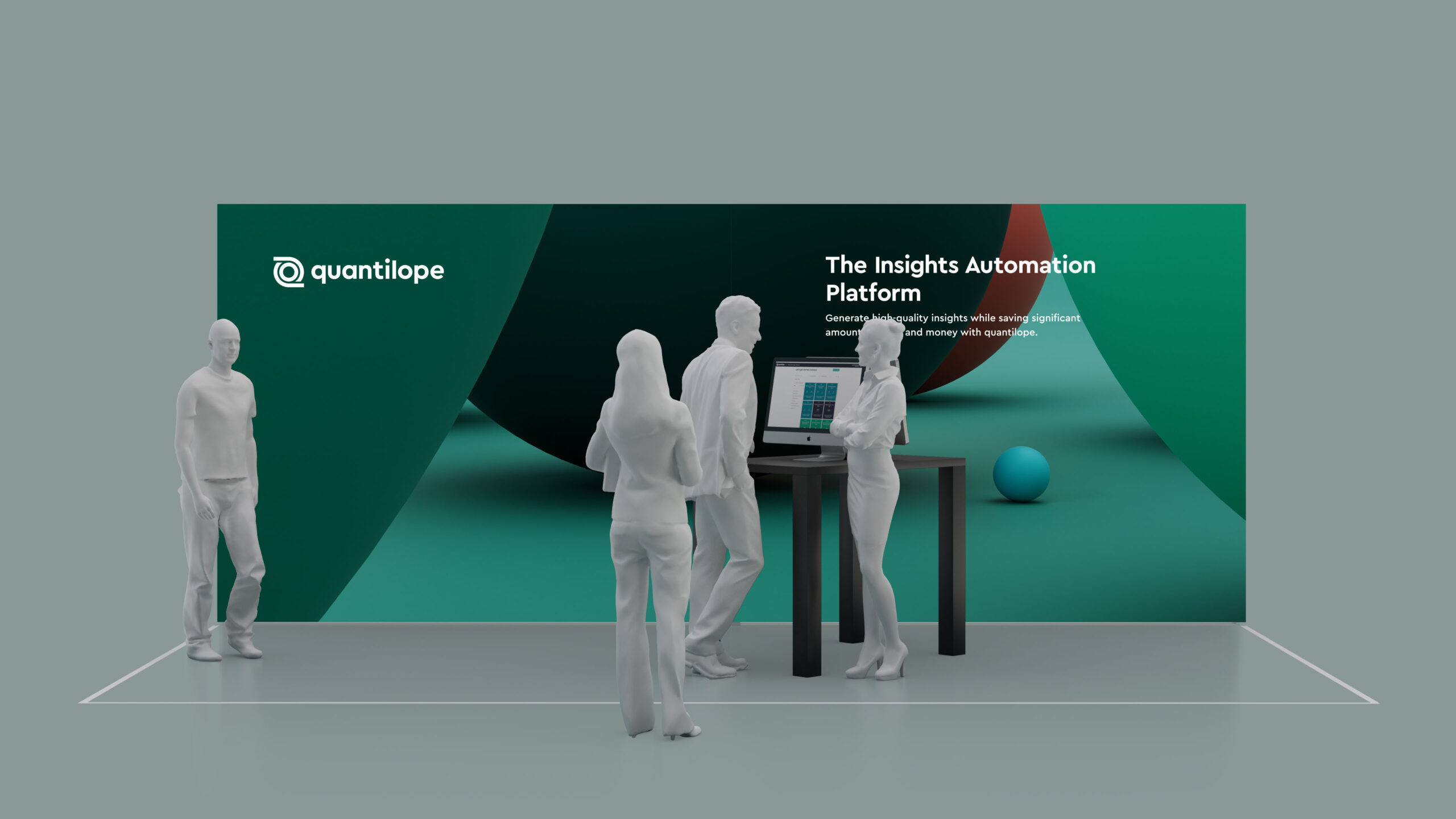
quantilope is an Insights Automation Platform empowering brands to do high-quality research better, faster, and more efficiently. The technology automates advanced research methodologies on an end-to-end platform connecting the entire research process from the creation of your project to advanced analyses and reporting.
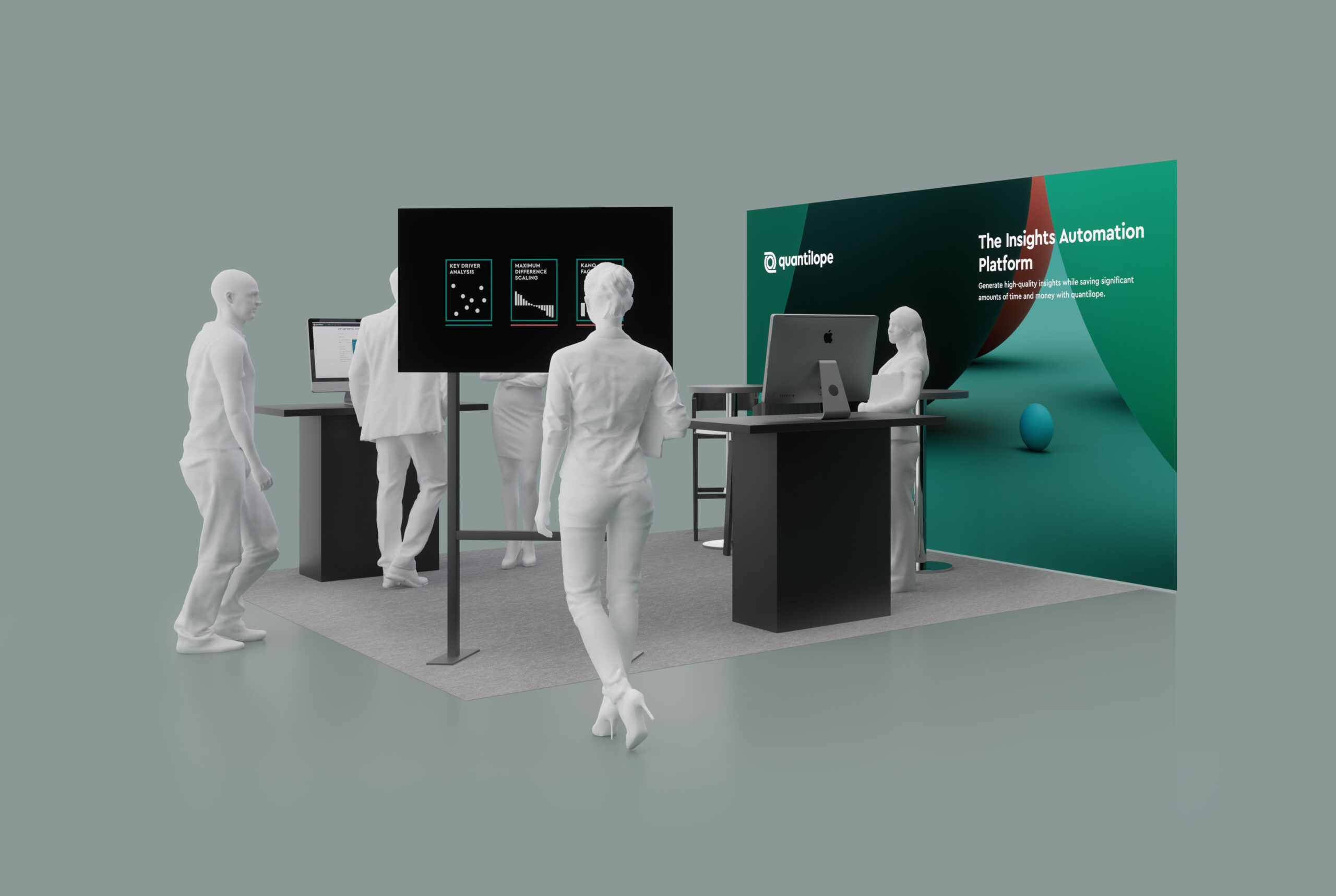
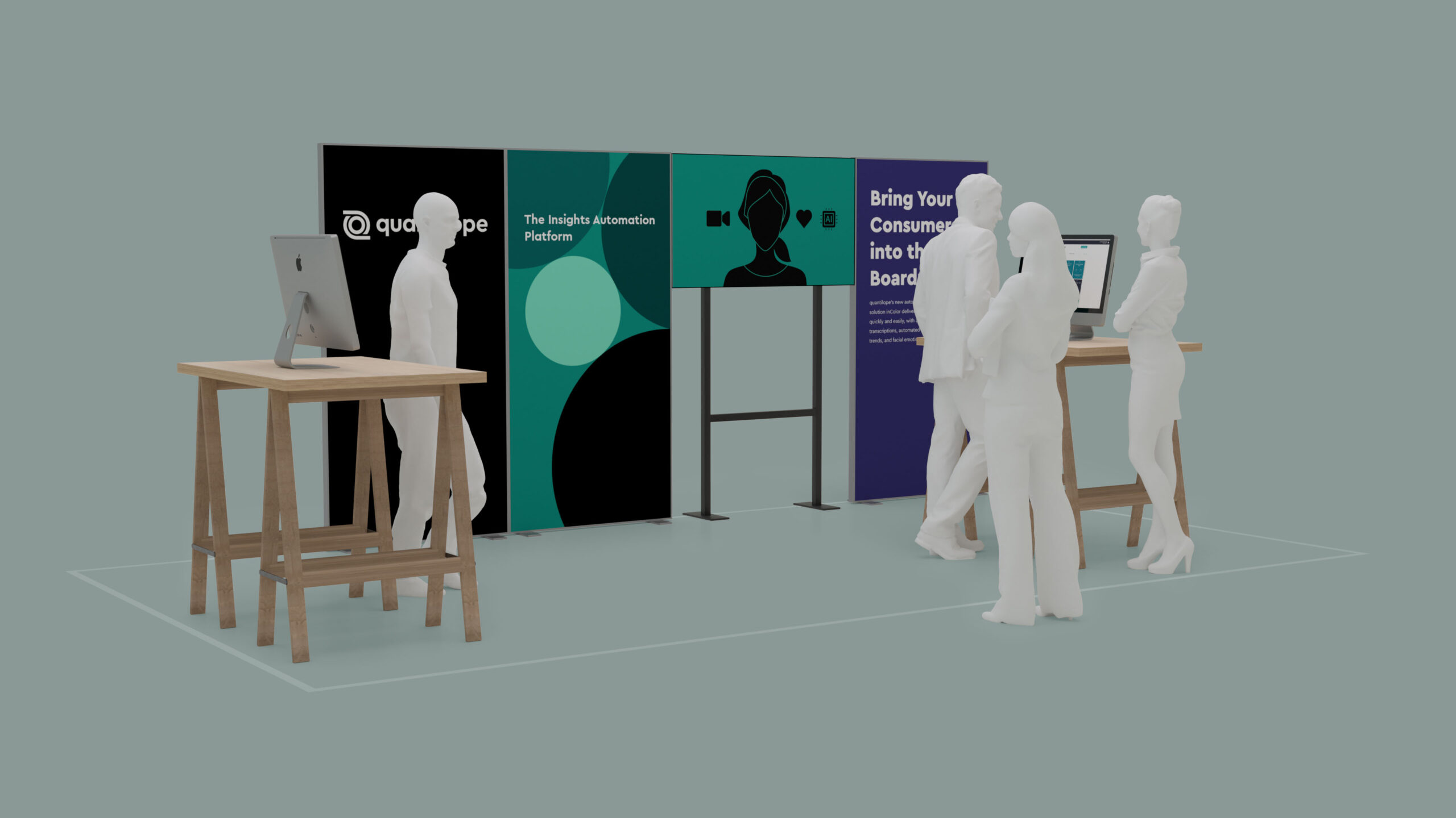
Brand Design / Brand Architecture / Corporate Design / Digital Design Systems / Digital Experiences / Virtual Spaces / Exhibition & Event

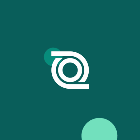
The new logo offers a modern look and feel with geometric shapes to reflect its strengths - quick learning, quality, empowerment and agility in insight management.
The new logo offers a modern look and feel with geometric shapes to reflect its strengths - quick learning, quality, empowerment and agility in insight management.
The new logo offers a modern look and feel with geometric shapes to reflect its strengths - quick learning, quality, empowerment and agility in insight management.
The Loop - The icon is based on the idea of the iterative process - Symbolic For Insights - The circle inside refers to a focusing eye - Care - Following sustainable global protection, refer to the outer rings of safety
The Loop
The icon is based on the idea of the iterative process
Symbolic For Insights
The circle inside refers to a focusing eye
Care
Following sustainable global protection, refer to the outer rings of safety
The Loop
The icon is based on the idea of the iterative process
Symbolic For Insights
The circle inside refers to a focusing eye
Care
Following sustainable global protection, refer to the outer rings of safety


Based on the logo, the inner circle as a dot describes the core message. It represents the data of the entire process chain and is the fundamental core in the value creation of the app.
Based on the logo, the inner circle as a dot describes the core message. It represents the data of the entire process chain and is the fundamental core in the value creation of the app.
Based on the logo, the inner circle as a dot describes the core message. It represents the data of the entire process chain and is the fundamental core in the value creation of the app.
Based on the logo, the inner circle as a dot describes the core message. It represents the data of the entire process chain and is the fundamental core in the value creation of the app.


quantilopeCorporate Design

Das Erste / ARD aktuellBranding

WDR / Studio ZweiMotion Design
Villa IchonUI/UX

Stübbe / X-ClassMotion Design

Schoppe Instant BeveragesCorporate Design
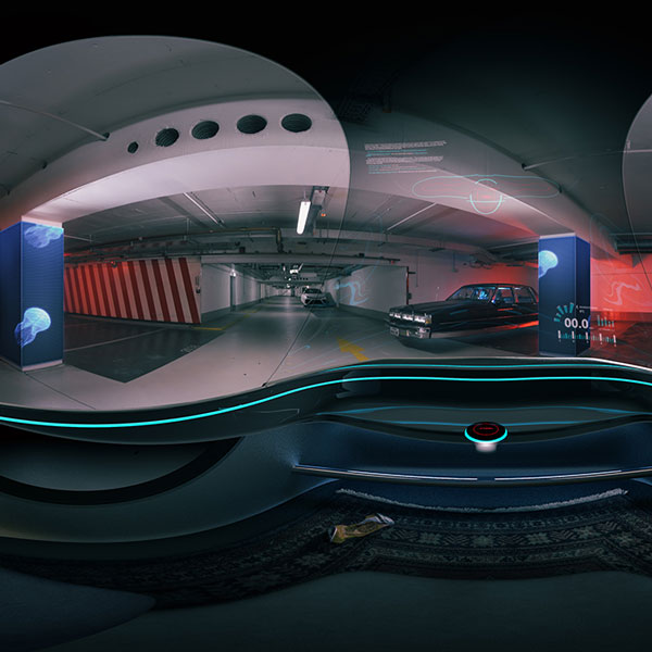
360° VR3D, UI/UX

Volkswagen Around The WorldMotion Design

Osteopathie MKCorporate Design
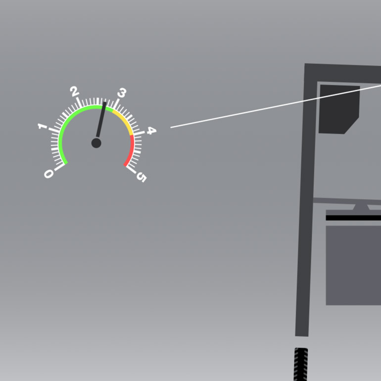
Continental / Brake TestMotion Design

Arte / Tracks NightMotion Design

Agenda VermittlerMotion Design